Part one was about why the song tab needed pictures at all. This part is about what I actually typed to get there — and why I didn’t know the answer myself before I typed it.
You knew what you wanted. Why not just plan the build yourself first?
Because I genuinely didn’t know how. I’m not a developer. I know what I want the result to feel like — my daughter looks at a picture, taps it, hears a song — but I have no instinct for how that should be structured underneath. So I stopped trying to design it and just described the situation to Claude instead, the way I’d describe it to another parent, not to an engineer.
What did you actually write?
💬 Prompt that worked “In the song tab, replace the small arrow icon in front of each song title with a thumbnail picture, and make each row taller so my three-year-old can actually see the picture and pick a song by it. Tapping the thumbnail should work exactly like tapping a cover in one of the other tabs: it expands to fill the screen, a small player appears at the bottom and starts playing, and tapping again collapses it back.
I’d like the tool that creates these thumbnails to be a separate program — the same way another tool I already use is separate from the main player and only feeds finished work back in through an Import button. Give it its own address if that’s the easiest way to do it.
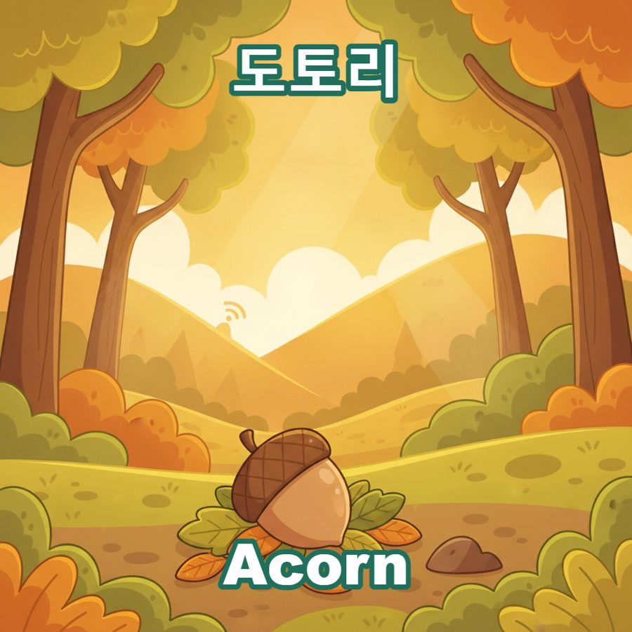
In that tool, tapping a song should first ask for the lyrics, with an easy way to help fill them in if I don’t have them typed up yet, and let me edit and save them anytime. Once there are lyrics, generate a few candidate images that match the content. Keep the original of whichever one I pick, plus a second copy with a Korean title on top and an English title on the bottom, sized so neither gets cut off. If any text has to appear inside the image itself, keep it in English only — Korean text tends to come out broken.
Finally, let me pull the finished thumbnails back into the song tab, one at a time or several at once.”
I hadn’t designed any of the architecture in that message. I just described the end state and let Claude figure out the shape of it.
What came back?
A split into two programs, not one. The song tab itself stayed simple — it just reads a small database of songs and displays whichever picture is attached. All the actual work — asking for lyrics, generating candidate images, adding the bilingual title — happens in a second, password-gated tool that only I use.
That second tool follows the exact same pattern as another one I’d already built for a completely different job: a photo-curation app my wife and I use to pick which of our daughter’s growth photos make it into her library. Same idea — a separate workbench that produces finished pieces, then a plain “Import” button that hands them to the app my daughter actually touches.
Why split it into two programs instead of building it directly into the kids’ app?
Because the two jobs don’t belong in the same hands. Generating and picking images costs a little (even on a free tier, it’s still an active choice I have to make), and it means looking at rough drafts before choosing a favorite. That’s adult work. My daughter’s tab should stay light, fast, and finished — she should only ever see the picture I already picked, never a pile of drafts.
Keeping them apart also means the kids’ app doesn’t need to know anything about image generation at all. If I ever swap which AI tool makes the pictures, the song tab itself doesn’t change.
Did you get it right on the first try?
Close, but not exactly — a few details (how the title gets sized, what happens with text inside the image itself) needed a couple of rounds of back and forth before they matched what I actually meant. That’s normal for me at this point. I describe the outcome, look at what comes back, and correct the parts that aren’t quite it.
The tool was ready. Now I needed something to actually generate a full set of pictures, one per song — and that took more trial and error than I expected. That’s part three.